
I'm following a software train wreck that I thought would be interesting to address while it's in progress. Since the early days, I've been a user of Google's Chrome browser. Back then, it was lightning fast and had a clean UI that I like to this day. I have the feeling it's lost a bit of its speed and even grace over the years, but it is till my browser of choice for 95% of what I do.
Recently, the folks at Google decided to radically "improve" the bookmarking experience. Overnight, what had been a simple, albeit unsophisticated, experience became a quasi-graphical head-scratcher that left me wondering how it had ever escaped from the development lab. Imagine my surprise when out of the blue I clicked the Star in the address bar to bookmark a site and the following appeared:

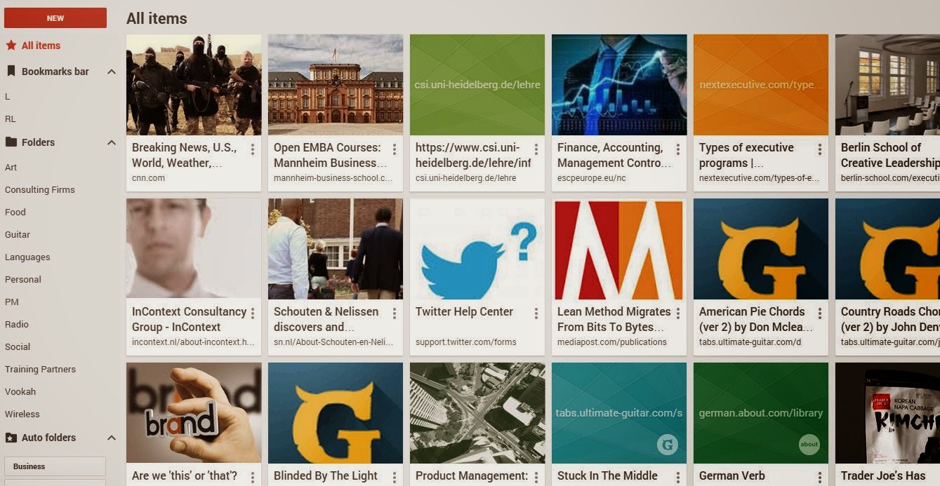
Unfortunately, not only is the basic bookmarking experience hopelessly flawed, the Bookmark Manager was also "improved" to the point of virtual uselessness. The default view shows you a graphical thumbnail for each link displayed in a flat list of all your bookmarks. For reasons that aren't quite clear to me, bookmarks not in folders seemed to have disappeared. I'm not sure I will ever understand this design decision.
Although these words sound harsh, I can assure I don't use them lightly. In my mind, this feature (or really feature area), as well-intentioned as it may have been, missed the mark by about a mile. I have to assume there was some greater vision guiding this design that was completely lost on us poor users trying to get stuff done today.
In Google's defense, you can disable the new experience and return to your comfort zone, although it's a multi-step process. Unfortunately, it sounds as if Chrome updates overwrite this setting.
So what can we learn from this ongoing saga? Here are my key takeaways so far:
- Some features don't require much innovation, even if they're not particularly exciting on the surface
- Given the competitiveness of the browser market, I have real trouble believing that the Bookmark Manager was Chrome's biggest issue: prioritizing is everything
- The prevalence of mobile devices is inspiring folks to make everything graphical -- we shouldn't assume such a change always represents progress.
- Giving folks a choice about adopting radical changes can save a lot of good will. This is a lesson that Google is learning and Microsoft has learned painfully on multiple occasions, e.g., Office Ribbon, Metro UI in Windows 8.
So what do you think of the new Bookmark Manager? What are your takeaways from the tsunami of negative responses to it?
Interesting I've learnt that Google changed bookmark manager from this post, which just confirms the point that it wasn't probably the biggest issue :)
ReplyDeleteYour post made me think about the problem of changing product for the late majority. Not only for Chrome, but for every mature product you should make a decision based on data, right? If so - then majority will always get what they want and you inevitably would loose those early adopters who didn't like where the product went.
We speak a lot about building personalized services, but do we do enough to build truly personalized products?
I know several people who still use quite dated versions of Firefox just for the sake of having "everything tuned as I like".
I'm really pissed that we didn't get a branching list view for not only the Bookmarks manager but for when we're actually saving Bookmarks. Branching lists! That has been in Windows' All Programs menu forever!
ReplyDeleteWow what a great blog, i really enjoyed reading this, good luck in your work. International Branding ca
ReplyDelete